Depth with Overlays in a Design System
Read time: 15 min.
Photo by Martin Sattler on Unsplash
The Concept of Height
In the article we are going to discuss how to use an overlay to help emphasize the illusion of height. Shadows have long been a staple of differentiating the height of elements and they work wonderfully on pages in which there are lots of lighter colors. I highly suggest you check out Josh Comeau's article on how to design beautiful shadows. As dark mode became more ubiquitous throughout the web, designers had to figure out new methodologies to emphasize the height of various elements on the page. While it is true that shadows can still be utilized in dark themes, they are far less effective, especially as the background color comes closer and closer to black. The solution that Material Design came up with was to use various shades of a color to differentiate the height of an element. As the shade becomes lighter the element feels as though it is closer, higher off the page. This imitates our natural world in some ways. Objects that are higher off the ground and therefore closer to a light source (often the sun) tend to be brighter.
The Old Way
In the past I would use opacity as a way to change the "shading" on an element. This worked well when I only had one theme on my site. I would lower the opacity of an element for which the only thing directly behind it was a solid color (often the background itself) and voila the color becomes lighter. At the time I did not need to differentiate height with lighter shades because shadows did the trick perfectly well.
However, once I started to implement a dark and a light theme this stopped working.
The problem is that the background color becomes responsible for the "lightness" or "darkness" of an element when we use opacity as a way to lighten/darken our components. Dark backgrounds will actually therefore make a color darker when we lower it's opacity. While visually this works with light colors, it is not really the purpose of opacity. Opacity should really be used for the sole reason that we want something to become translucent and not as a way to alter the color of an element. There is a better way and we can do it entirely with css.
The New Way
The solution is to utilize an overlay. A semi-transparent layer is placed over any element that we which to lighten and we adjust the opacity on the overlay instead. As an example I have designed a simple styled-component to show how this can be done using ::before in css.
tsximport {useEffect, useState} rom 'react';import styled from '@emotion/styled';const Container = styled.div`display: block;position: relative;height: 300px;width: 500px;background-color: rgb(var(--color-app-primary));transition-property: background-color;transition-duration: 300ms;transition-timing-function: ease-in-out;will-change: background, color;&::before {content: " ";position: absolute;top: 0;left: 0;height: 100%;width: 100%;z-index: -1;background-color: rgba(255, 255, 255, 0);transition: background-color 250ms;}&:hover::before,&:focus::before {background-color: rgba(255, 255, 255, 0.1);}`;export default function Card({...rest}: React.HTMLAttributes<HTMLDivElement>) {return (<Container {...rest}>Some Text or Elements Here</Container>);}
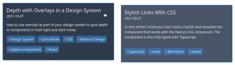
Probably the most interesting piece of this is that we needed to set the z-index on the ::before to -1 to make sure that it doesn't cover up all of the other elements and text in the container. Focus and hover will now lighten the background of the container on light and dark colors. The final results for my particular use of this container can be seen below.

The effect may seem subtle but it really provides a nice pop while navigating the page. It is also functional in that users will be able to more easily know what is currently focused. As a final bonus the component will work as intended no matter what colors we assign as our primary color, be it a light color or a dark one. They will both become slightly lighter when the component is focused or hovered over.